The prints of Aaron Coleman give rise to the old claim that art can change the world. Indeed, the work of Aaron Coleman brings together different factions of philosophy, religion and hip hop culture to make very strong messages about the artist's feelings on society today. They are so strong in fact that they proclaim a day of reckoning is upon us.
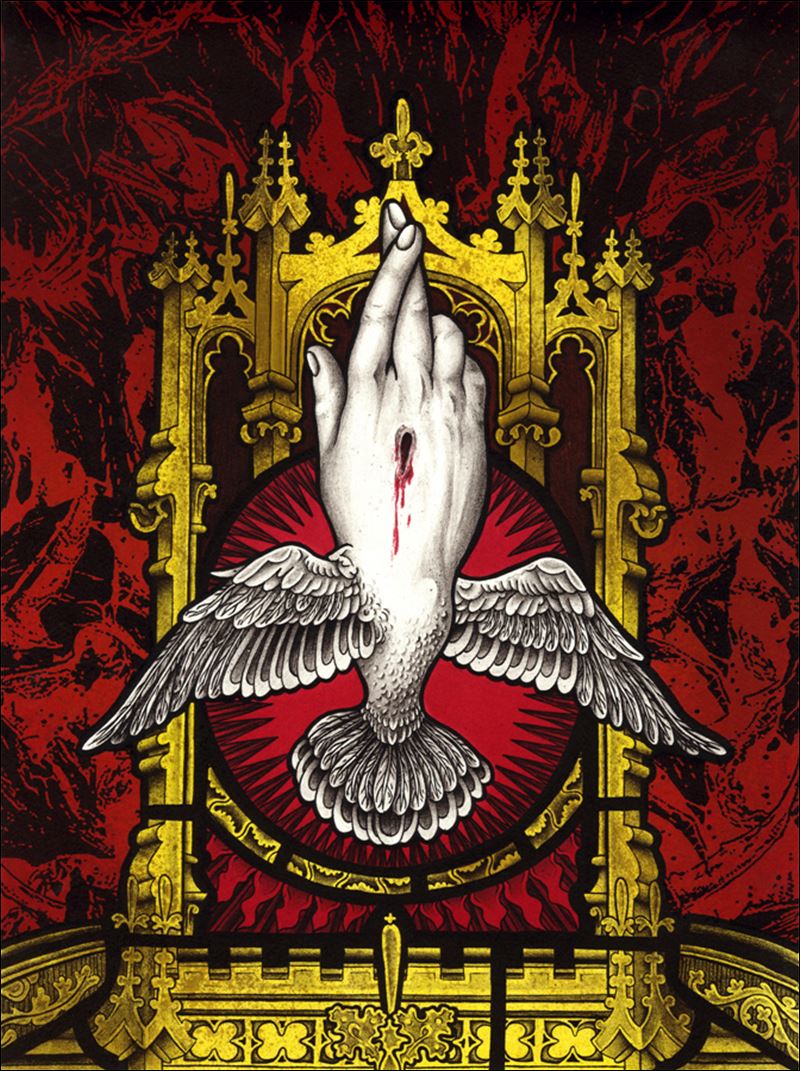
This work is bold, colorful and poignantly creates messages that hit the viewer like a lightning bolt. Here is an artist who is fearless, who deftly blends together images of saints, silhouette beating of Rodney King, graffiti and much more. Coleman is using all imagery at his disposal to create striking and effective work that reflects our fears and hopes. He mashes it all together and through the chaos we will hopefully find redemption and be saved. Let us all revel in his glory, for this is an artist worth watching.
Coleman is a mixed media artist/printmaker whose works focus on political and social issues. He combines imagery from comic books and stained-glass windows to raise questions concerning misconstrued belief systems and twisted moral values in our society. Coleman’s background in hip-hop culture and street art is also a major influence in his work.
Born January, 1985, in Washington D.C.
MFA, Northern Illinois University, DeKalb IL
BFA, Herron School of Art and Design
Assistant Professor of Art, University of Arizona, Tucson, AZ
Also taught at California State University, in Fresno and Northern Illinois University, in Dekalb.
Public collections:
Ino-cho Paper Museum in Kochi, Japan
The University of Colorado, CO
University of Tennessee Knoxville, TN
Wichita State University, Wichita, KS
Yekaterinburg Museum of Art, Yekaterinburg, Russia
and many other public and private collections.